Week 10
Level Design
"Follow The Line"
The level "Follow the Line" is now "mostly" complete. The line generator took what felt like forever to build, but it is now done.
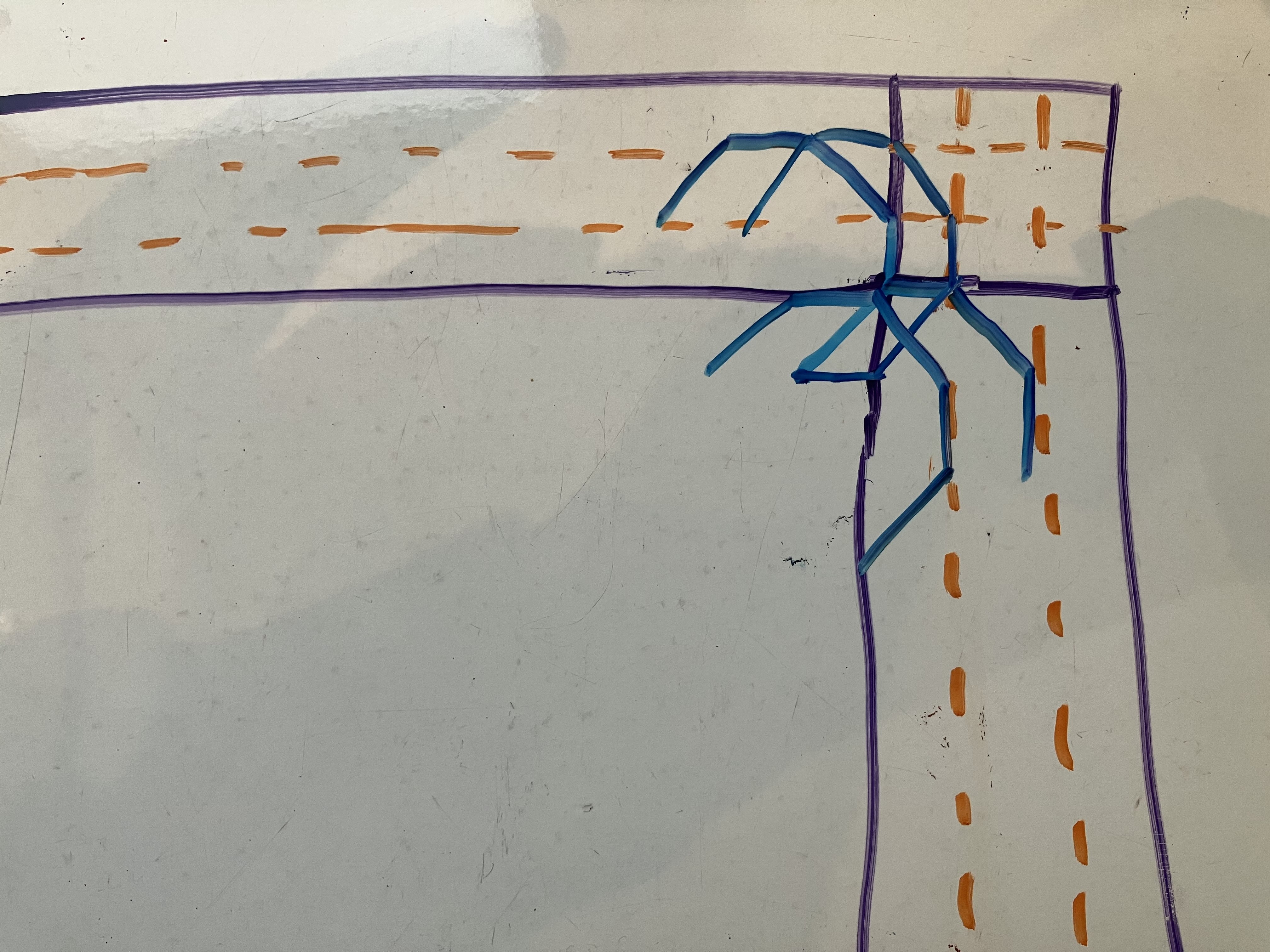
Part of the issue was dealing with the borders, especially the corners. I had to account for scenarios where the line reaches the corners of the map, and it wasn't as simple as telling the line to turn back. Figure 1 shows an example of me trying to visualise how to deal with corners on a whiteboard due to how complex each scenario was.
The following figures show stages of line generator from its functioning point to its now complete state.
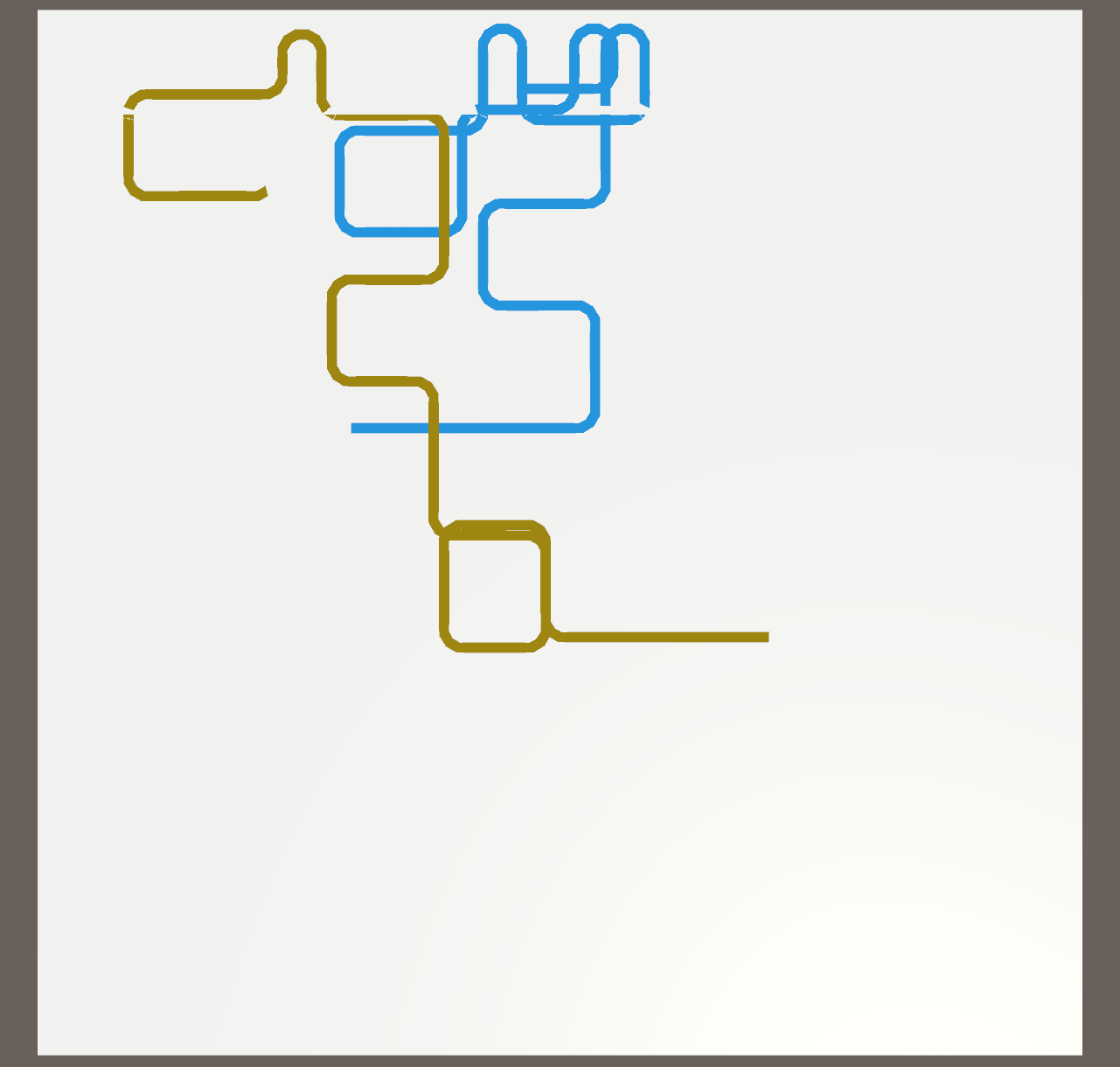
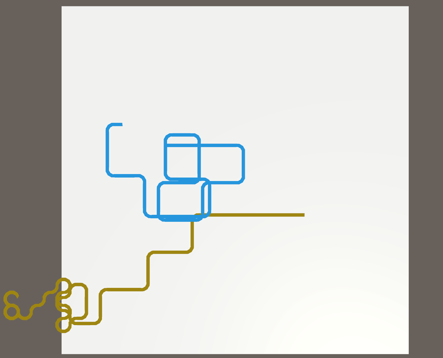
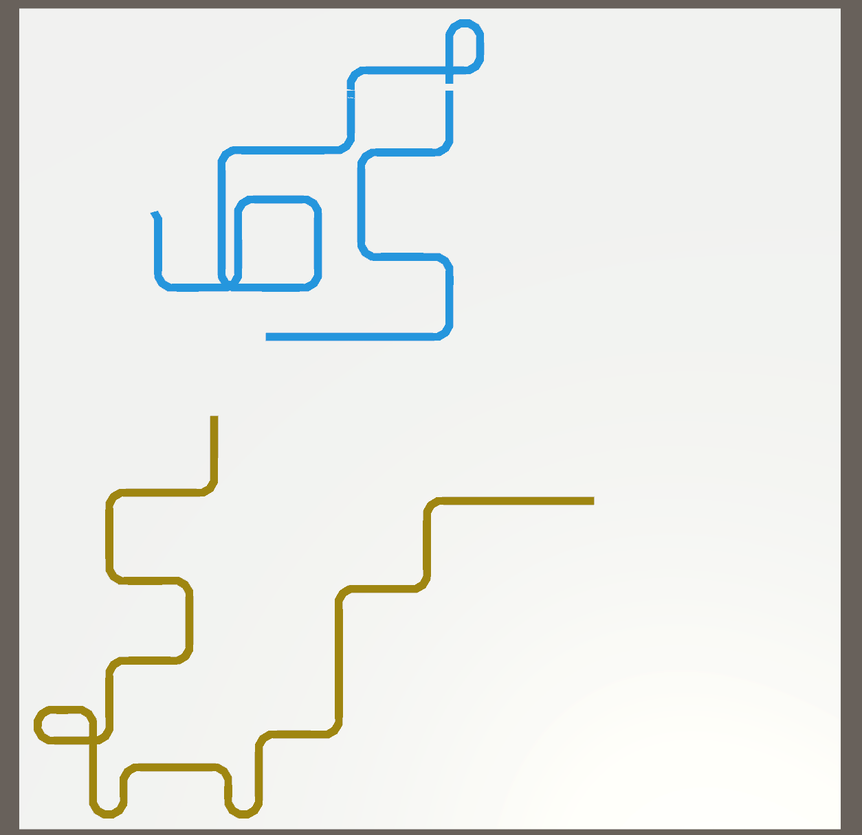
Unfortunately, I could not entirely stop the line from getting stuck and getting lost out of bounds. I resorted to the line resetting entirely if at any point it detected itself going out of bounds. It had reached a point where the chances of the line going out of bounds was extremely minimal and the line would be even less likely to reset more than twice. There was a bug that caused the line to move on a different axis rotation; however, since the line still stayed within the boundaries, I did not bother fixing it as it was not a major concern.
The only things left to do is test if the player's will draw a line and if the game can detect when the player's line will overlap with the set line. The code for this has already been written, so it's just a simple matter of importing the assets for testing. The scoring will be dealt with at a later date, closer to when the game is about to be finalised.
"Narrow Path Maze"
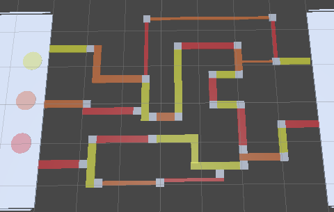
The Narrow Path level has been created with an initial concept of various maze and puzzles that the player must solve whilst moving on narrow pathways. There currently four pathway concepts:
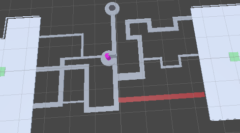
A simple maze with puzzle mechanics that allow a player to take a faster or easier route.
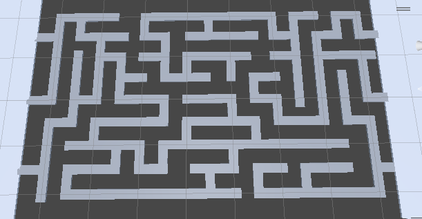
A classic maze that the player must navigate to reach the other end
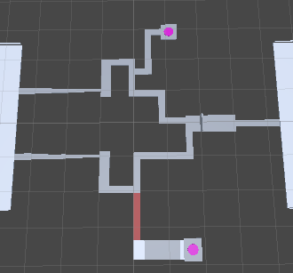
A puzzle that the player must solve while still on these pathways.
A narrow path maze that the players must work together to activate a path to get across.
Game UI
In this devlog I'll take a look at the evolution of our game interface, game elements, and environments, focusing on the challenges and decisions we faced from initial sketches to final designs.
1. Initial layout and concept:
I started by sketching out the basic layout of each level, as shown in gif.1. This includes the position of the element's button and the initial position of our two characters. Sketches were refined with detailed feedback from level designers to ensure every element was perfectly placed for optimal gameplay.
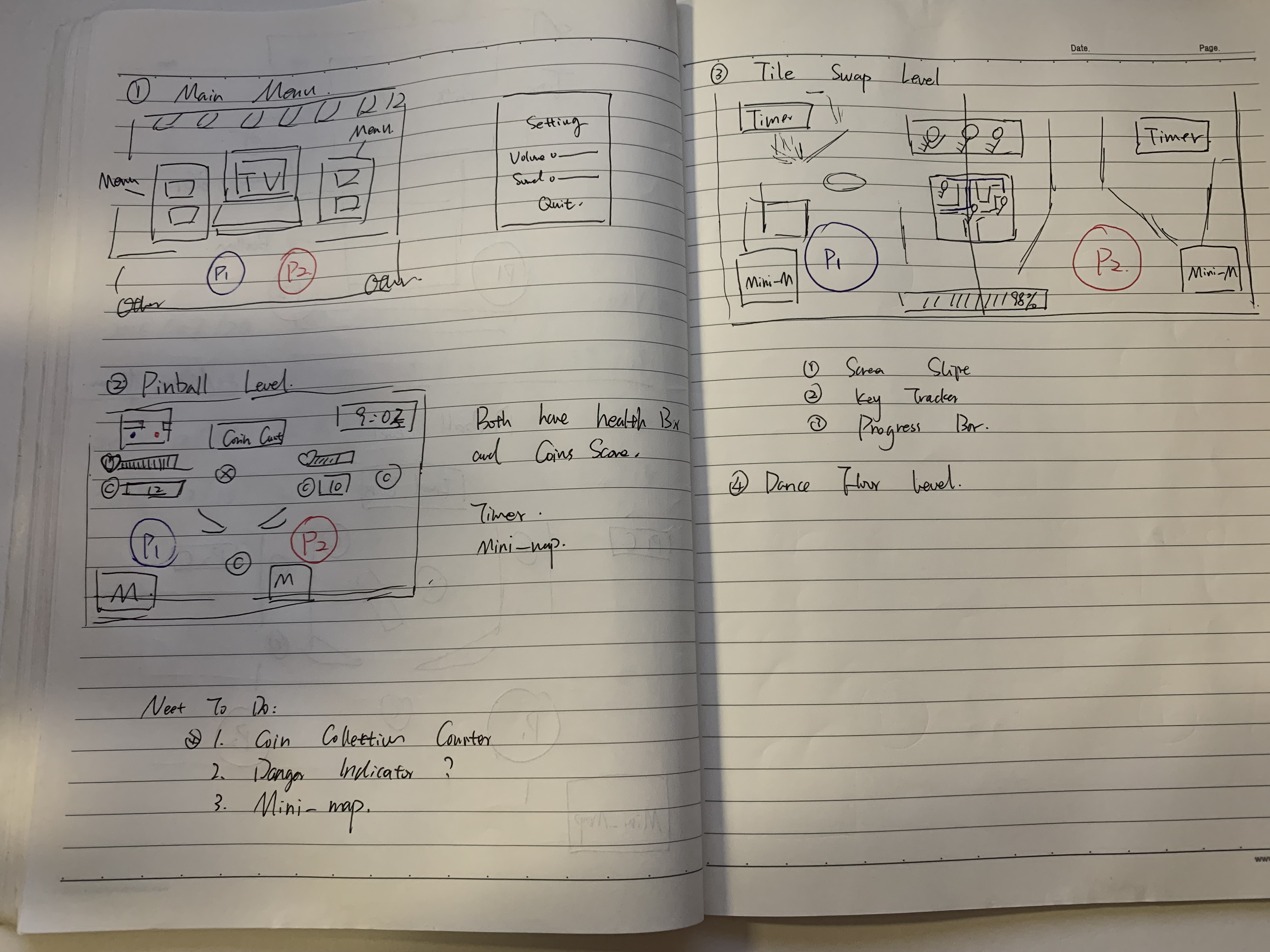
gif.1 : In this sketch, each level is simply depicted.
2. Main menu design:
I tried two different main menu styles: a 3D version (shown in gif.1) and a flat design. After considering these two points, the flat design was chosen because of its cleaner and more modern look.
3. Theme consistency and background selection:
One of my main challenges was finding a background that matched our theme colors. Despite searching countless images, nothing seemed to fit perfectly even asking an AI image generator for help (as shown in gif.2). Although it offered a variety of options, the result was too colorful and didn't fit the aesthetic we wanted, causing me to abandon my original choice (gif.3). After revisiting and sourcing, I settled on the design described in gif.4, which complements our theme perfectly.
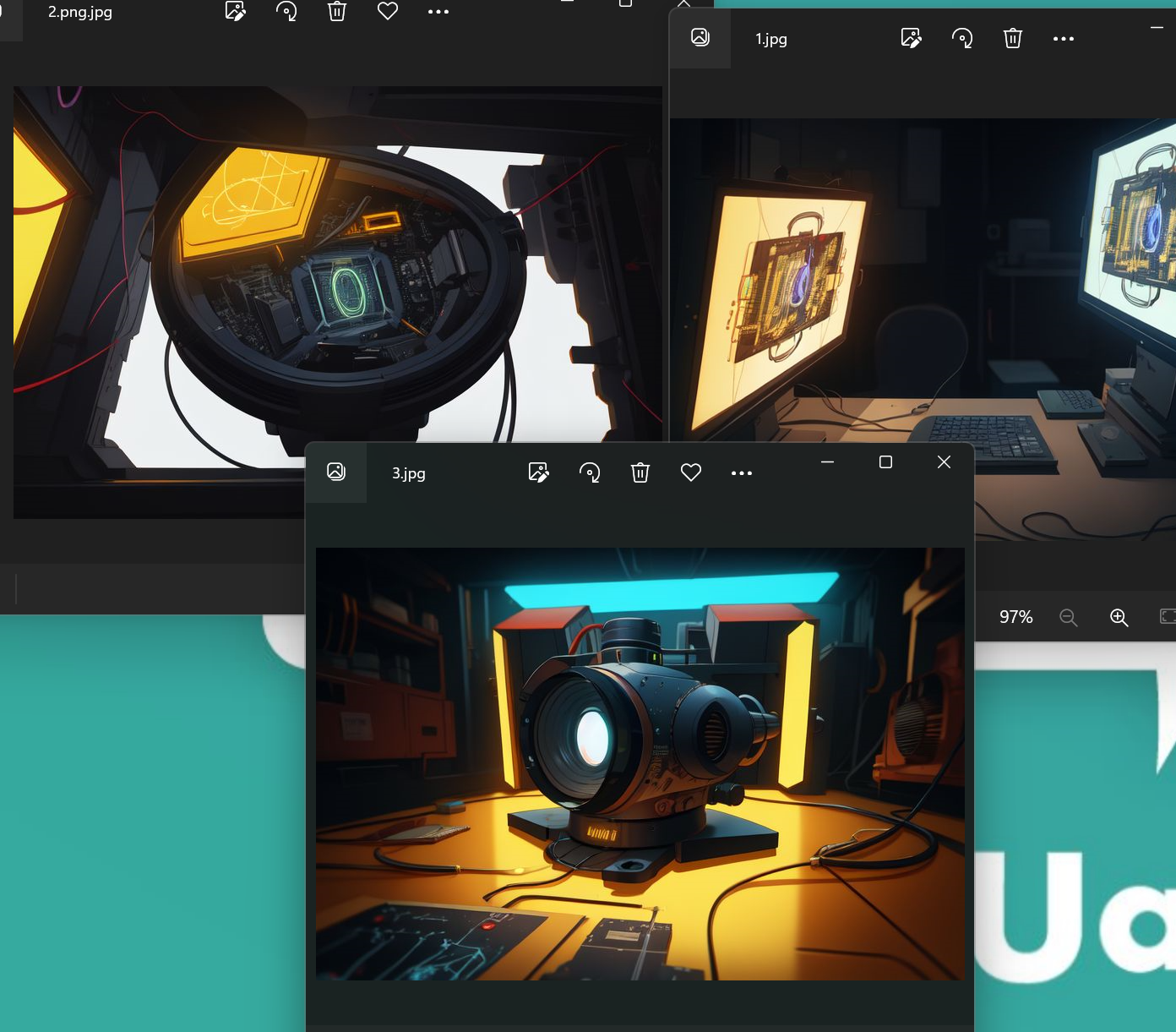
gif.2 : AI Image, actually it quit pretty cool.
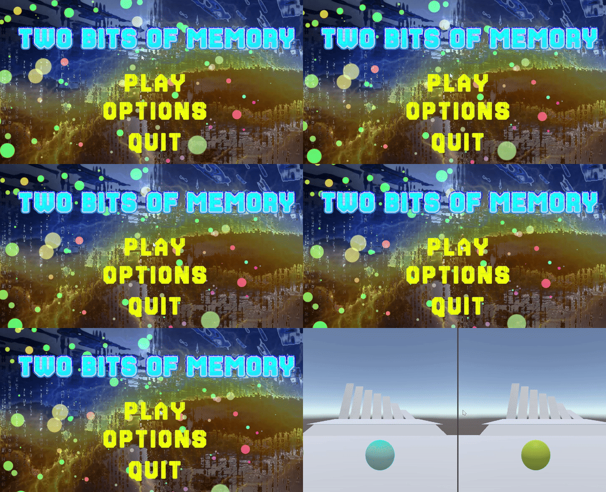
gif.3 : First Main Menu Design
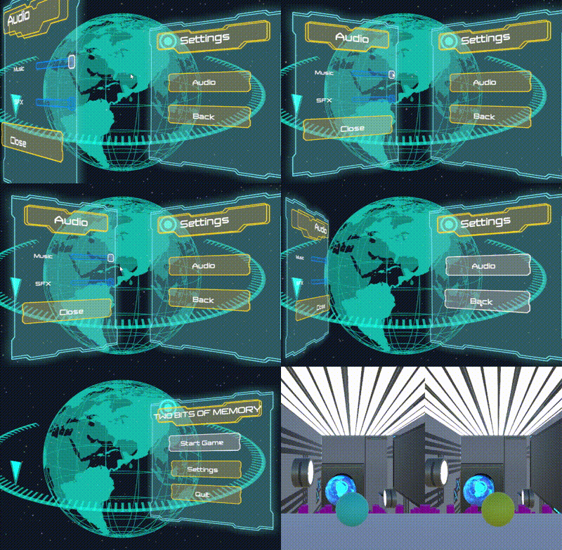
gif.4 : The final Main Menu
4. Resource utilization:
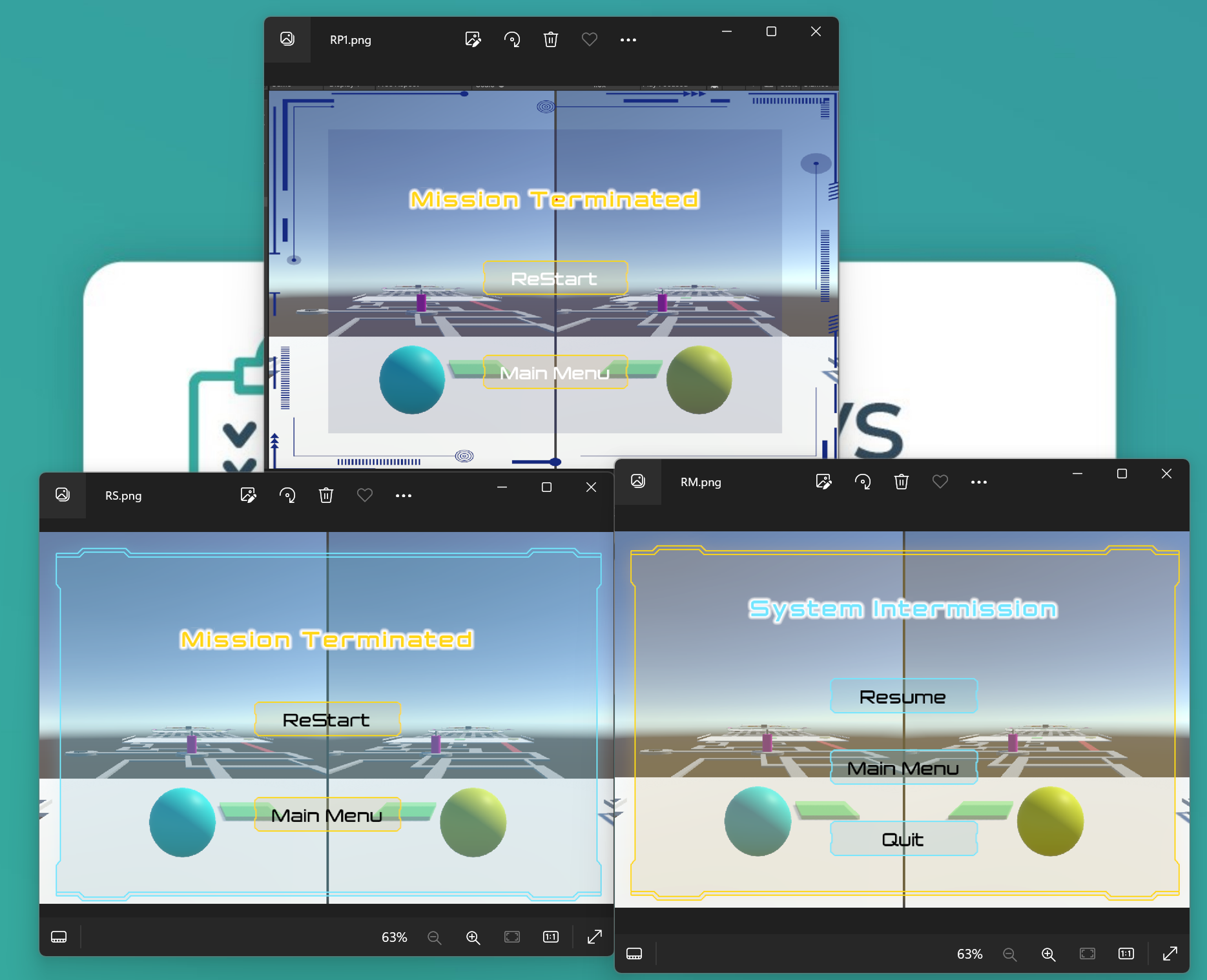
UI elements come from platforms such as itch.io and the Unity Asset Store. We also use tools like Blender to further enhance our designs. (gif.5) I handled the scripting of the main and pause menus as well as some other UI components. However, our lead editors need to make adjustments to ensure these elements respond correctly to player interaction.
gif.5: The Top picture was the old restart menu design, the bottom pictures was final design for pause menu and restart menu.
5. Environmental design challenges:
I initially tried designing the game environment in gif.6, and while it followed the concept guidelines, it still felt lacking in aesthetics. To find materials that are more consistent with the theme, I continue to explore more suitable resources to improve the environmental design to the ideal.
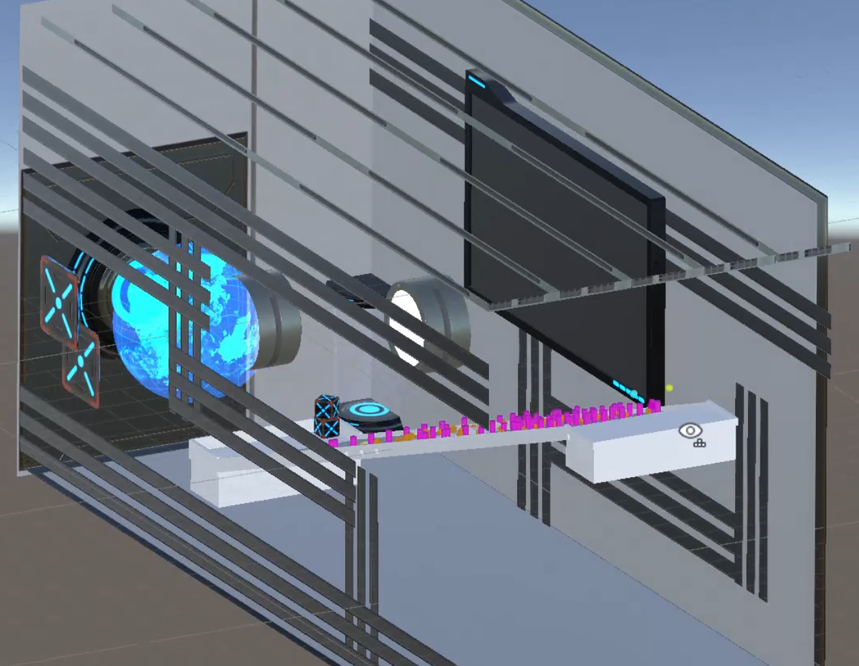
Puzzle Components
Checkpoints
These checkpoints simply work by recording the last checkpoint activated and when any player falls of the map teleports the player to that position.
Tilting Blocks
These tilting blocks work by using a hinge joint from two stationary blocks onto the main tilting blocks. These tilting blocks are locked to never go beyond an angle, this helps customize their difficulty for various scenarios.
Teleporter
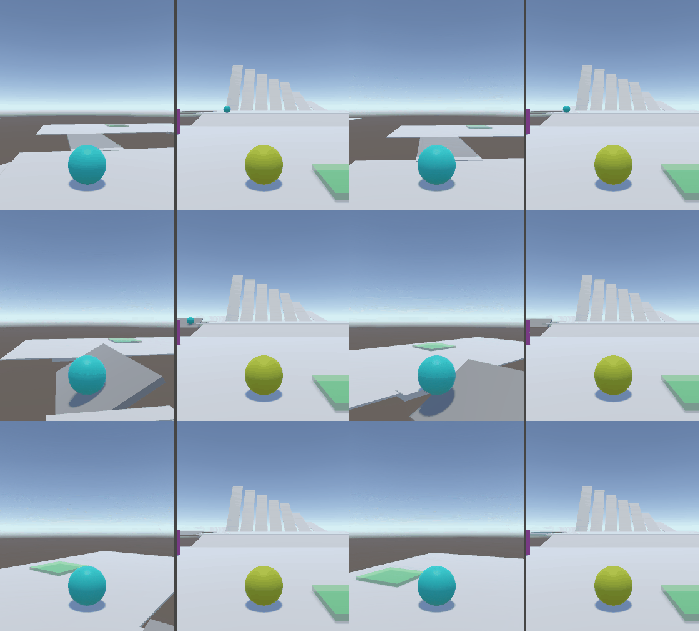
These teleporters simply teleport any player that hit them to a preset location. These are helpful for moving the player about and are very useful for debugging areas late into a level.
Boosters
There are there types of booster that have implemented, a booster that adds a set speed and direction to the player, a booster that sets the speed and direction of a player, and a booster that just adds speed to the player in any direction.
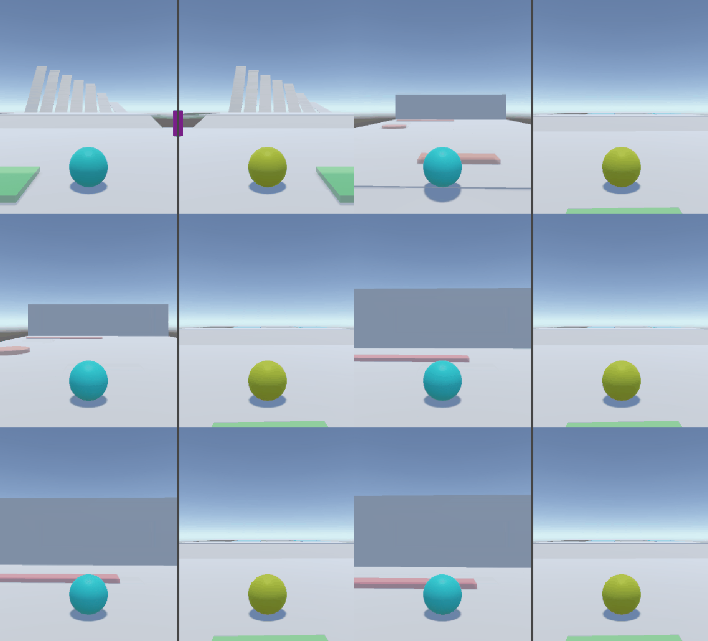
The booster that sets the speed and direction of the player is very useful as it can be used as a launcher to move the player through the air to a desired location.
Files
2 Bits of Memory
A 2-player ball rolling platformer
| Status | Prototype |
| Authors | LuddyFish, Oliver Nillsen, Ke, Y_R) |
| Genre | Platformer |
| Tags | Puzzle-Platformer, Two Player |
Leave a comment
Log in with itch.io to leave a comment.