Week 4 - User Interface
This week's focus was on building a UI for the player. I originally had planned to build upon enemy AI but I wanted to get the main UI elements done and dusted first to give the player a clean feel of the game.
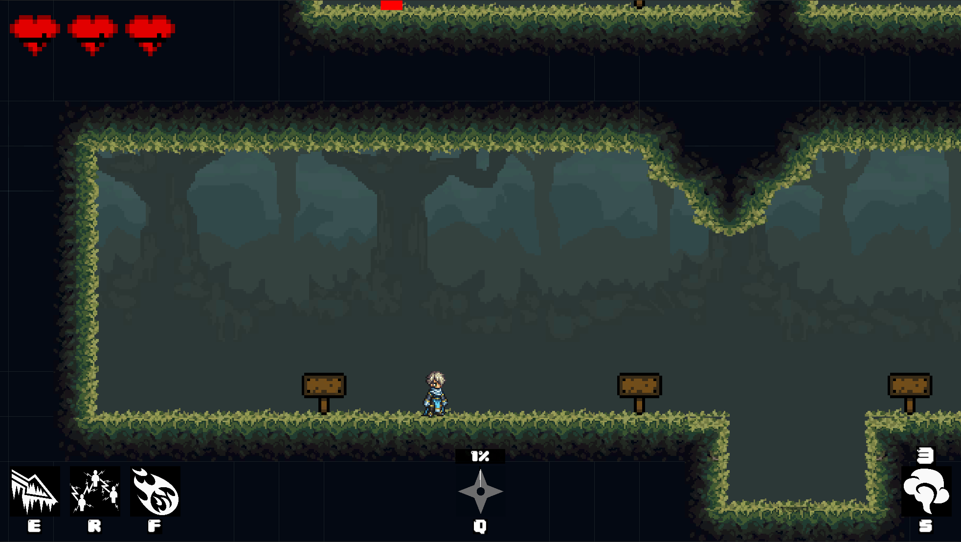
There is not much to talk about this week other due to the UI being the main thing being built. The final product of the week is shown in Fig.1.

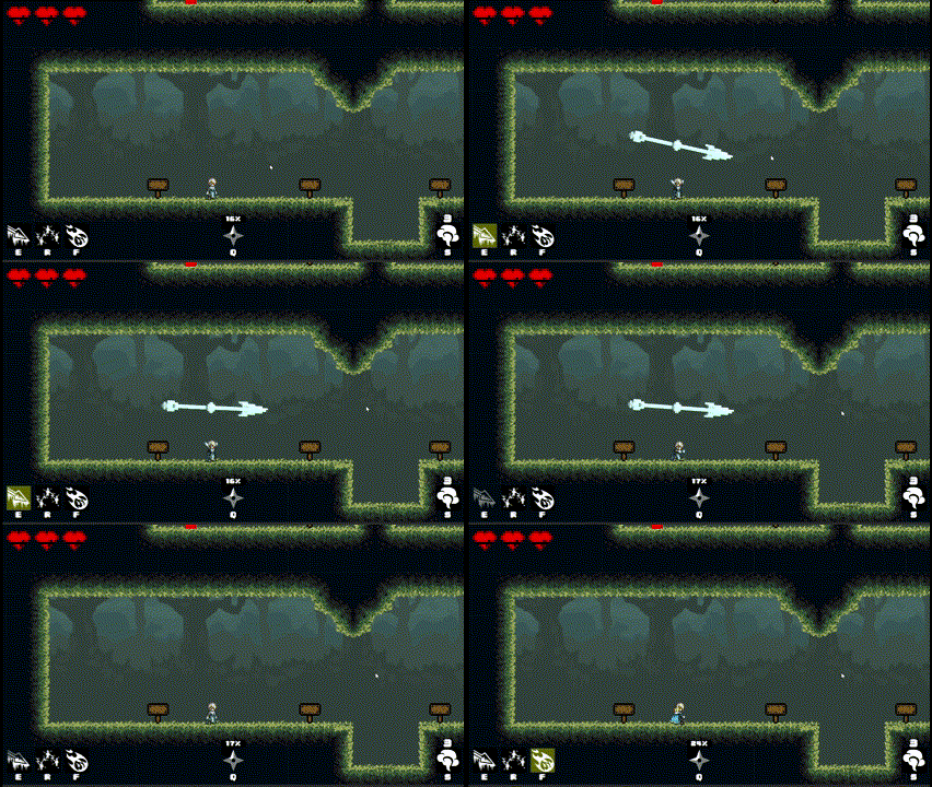
In Fig.2, the GIF shows the Ice Spear icon on the bottom-left highlighted yellow when the player is using it. This was a simple effect to do for all icons, having a separate GameObject overlaid that only activates when the key is held down. The ability after use also has a visual cool down where the icon is darkened out and lights up over a period of time. A similar method was used.

For the tutorial level, to help explain to the player what they have to do, I created many signs that each contain a piece of text to inform the player of what to do in each section. When the player stands next to the sign, a pop up will appear as shown in Fig.3.

Ninja Wizards
Ninjas and Wizards. Combine them together and you get a deadly dance of mystical grace
More posts
- Documentation + User GuideOct 15, 2023
- Week 6 - Game World, PolishOct 14, 2023
- Week 5 - Enemy AI, Title ScreenOct 08, 2023
- Game TestingOct 05, 2023
- Week 3 - World Map(s)Sep 24, 2023
- Week 2 - Player AbilitiesSep 17, 2023
- Week 1 - Player MovementSep 08, 2023
- Game Concept (Assignment 2)Aug 20, 2023
Leave a comment
Log in with itch.io to leave a comment.